


Do you sometimes need inspiration to help get your creativity flowing? « Back to list

Check out these ten top movie poster designs from 2017
Oscar Wilde once said that life imitates art. Maybe it does and very often design trends imitate – or at least draw inspiration from – art and culture. When it comes to design we’re not all fortunate enough to have the same freedom or subject matter as the designers who work on huge projects like movie posters. A great deal of work goes into promoting multi-million dollar movies and the movie poster is a big part of that promotion. We’ve picked out ten movie posters from 2017 we think illustrate great design, creativity and effectively convey moods or styles you might be able to use as inspiration for some of your design in 2018.
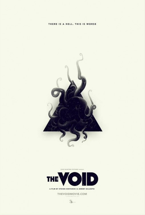
The Void
This minimalistic poster uses white space to draw the eye to the image. Simple typography adds to the stark feel of the poster and the design is a great example of how to use space effectively.
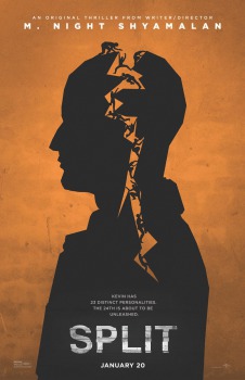
The Split
Another very simple idea based on the classic Hitchcock depiction. The silhouette on this background makes for an extremely effective and eye catching poster
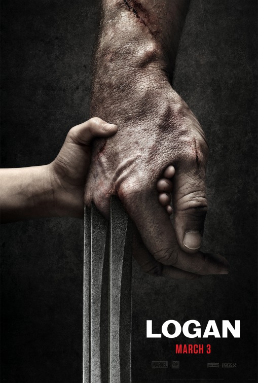
Logan
Many superhero posters go for an all-action feel, crammed with visuals and typographic information. In stark contrast to that trend this poster uses one very powerful image and minimal text.
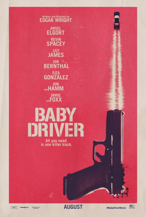
Baby Driver
Great use of only two colours and one single image that illustrates what the movie’s all about – crime, violence, fast cars and music. The poster would almost certainly be less striking or effective with a full colour image.
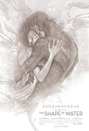
The Shape of Water
A beautiful illustration is perfect for this poster promoting the Oscar winning Guillermo del Toro film. The artwork itself is enough to draw the eye and portray the perfect mood.
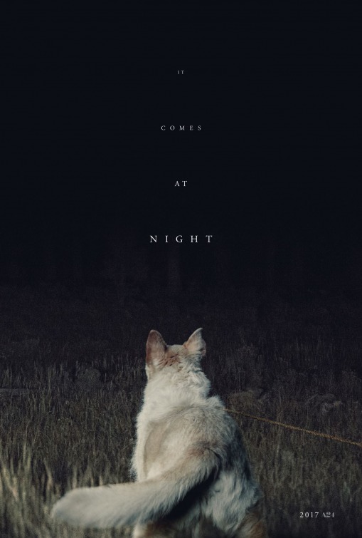
It Comes at Night
The poster for this horror film uses a high contrast image to great effect, from the white dog in the foreground to the deep black background. Even the commonly used Times Roman takes on an altogether creepier feel against the depth of the image.
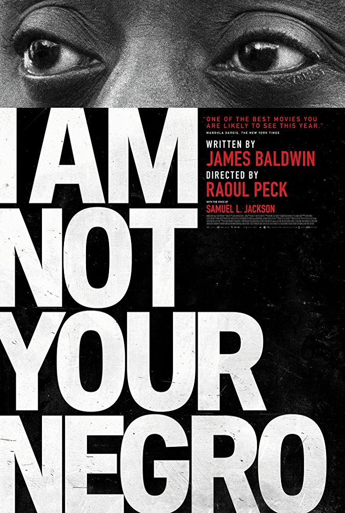
I am Not Your Negro
This poster brilliantly uses large, stark typography and a striking image to ensure you can’t ignore the evocative title and message of the movie.
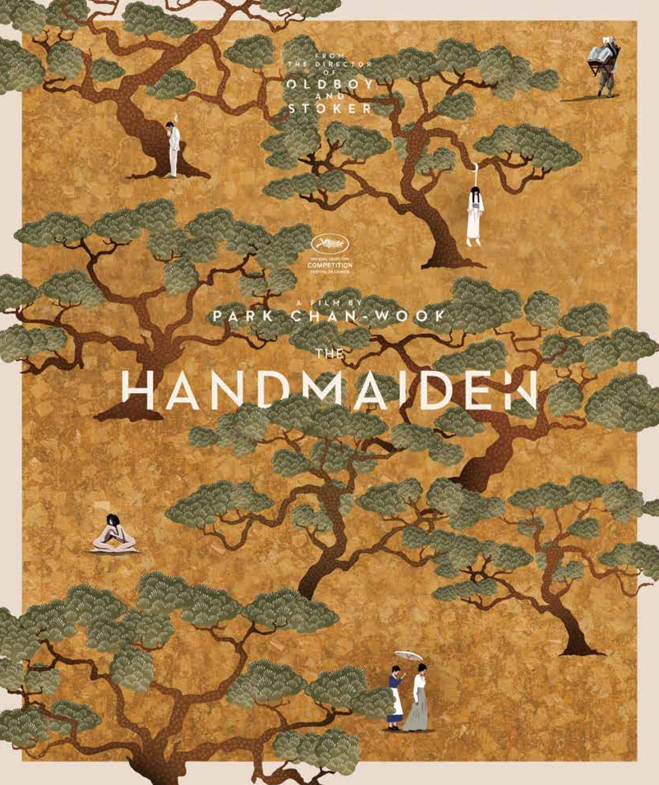
The Handmaiden
Another great use of illustration, this time inspired by classic Korean art. A beautiful, illustration in its own right, a closer look reveals detailed visual depictions from the story.
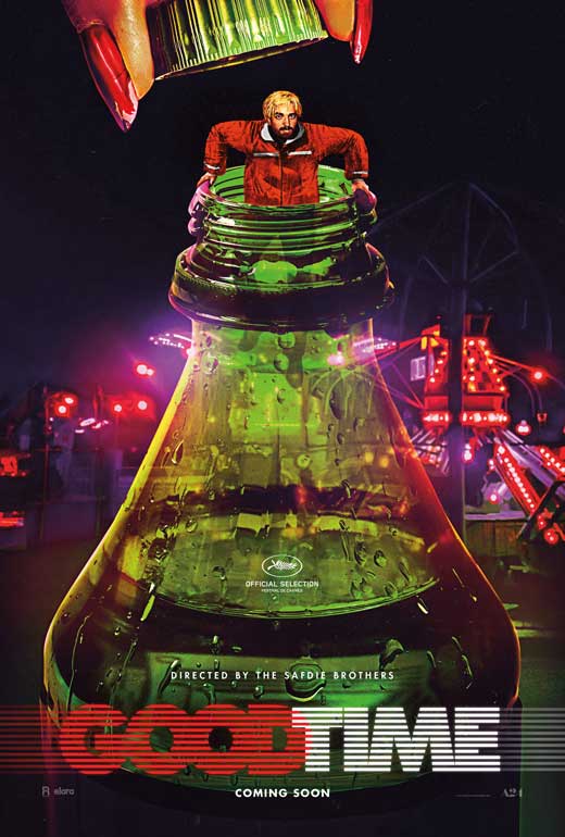
Good Time
The most colourful in our selection, this poster actually has only two elements. The illustration and the film title are all that’s required. This poster shows that if you use the right image and text, you don’t need anything else to get noticed.
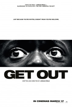
Get Out
The eyes alone in this black and white poster would be enough to grab the attention. Add the simple sans serif font combined with great use of white space and it’s another great example of how a simple idea can be extremely effective.
TradeDigitalPrint.co.uk supply a range of printed marketing products to registered trade customers at exclusive prices. Our product range includes everything from business cards and books to posters and outdoor advertising like 48 or 96 sheets. Our award winning website makes it easy to get pries, upload artwork and order. All of our print, prices and turnaround times are guaranteed so to work with a professional trade printer, simply visit www.TradeDigitalPrint.co.uk today.