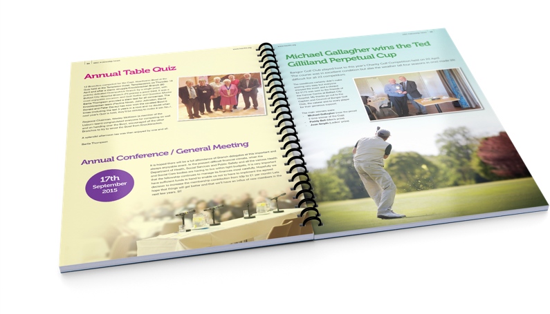
Help your clients choose the right colour palette for their brochure
Get in the mood with colour
We all have favourite colours and our clients are no different. However, often the colours they think “look nice” are not the best colour choices for their latest campaign – or their target market. When clients look to designers and marketers for advice on their new company brochure they don’t always know what colour combinations will best portray their business or their message. Many businesses already have extensive colour palettes and a clear corporate identity. Whether or not that’s the case, most rely on their designers to advise on all of the creativity for their new brochure, from content to colour.
The psychology of colour
One of the oldest examples of colour psychology is that “baddies” wear black while white is used for good or spiritual characters. In marketing we use certain colours to represent or provoke different moods or feelings based on what we’re selling or whom we’re targeting. For example:
Red is often used for passion, love and can represent living dangerously. Some research shows that red stimulates hunger so it’s often used in fast food and snack labeling. Red demands attention and represents action so is commonly used as the CTA in advertising.
Blue suggests reliability, stability, trustworthiness and serenity so is often used as a calming colour. You won’t see blue used very much in food branding as it’s thought to reduce the appetite.
Yellow is seen as a very positive colour representing sunshine, joy and happiness. Like red it grabs the attention although is more playful, light-hearted and fun.
Orange, a mix of red and yellow combines those two moods so is another positive, happy colour. Not as aggressive as red it still grabs the attention and represents youthfulness and health.
Green also represents well-being and health with strong associations to nature. It’s often used for natural, organic and sustainable products.
Purple is often seen as signifying luxury or royalty. It suggests sophistication and often symbolises wealth, power and creativity.
In brochure print, darker colours are generally used for text with lighter colours used for background graphics. There’s nothing wrong with using more than one strong colour for text as long as you ensure the foreground colours are not not fighting with background colours or images. If your customer hasn’t yet considered a corporate colour palette, their new brochure is a great place to start, so you can suggest the colours you use in their brochure form the basis of their new palette going forward.
TradeDigitalPrint.co.uk offer a comprehensive brochure printing service for our trade customers. Any colours you choose for your brochure will be beautifully reproduced in the print produced by our HP Indigo presses. Choose from an extensive range of sizes, binding and paper options. Order our swatch book with examples of all the paper types, weights and finishes we supply including our stunning luxury paper range. For more information or to get a price, upload your artwork and order your brochure online, visit www.TradeDigitalPrint.co.uk or contact our expert trade print team today.


